About Project
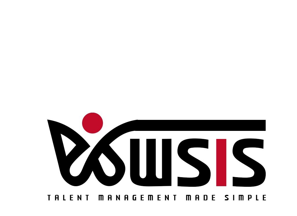
Clients Business Name = WSIS
Project Name = Logo Design
Technology = Adobe Photoshop
What We Work = We designed a professional and impactful logo for WSIS using Adobe Photoshop, capturing their identity as a trusted manpower supply and HR consultancy company.
Case Study
Summary :
WSIS is a growing HR consultancy firm specializing in providing manpower solutions across various industries. Their mission is to connect skilled individuals with organizations in need of top-tier talent, bridging the gap between human capital and business growth.
Our Role :
- Conducted brand research and competitive analysis
- Developed logo concepts aligned with the company’s mission and services
- Designed the final logo using Adobe Photoshop
- Delivered multiple variations (color, black & white, icon-only) and file formats (PNG, SVG,JPEG, PSD)
Problems :
- Lack of Brand Identity: WSIS had no existing logo or visual identity, making it hard to create a professional impression.
- Generic Competitor Logos: Many competitors used basic or similar-looking logos, causing brand confusion.
- Low Brand Recall: Their old visuals (if any) were not effective in communicating the company’s core values.
- Unclear Visual Direction: The WSIS team wasn’t sure what visual style would best represent their services.
Solution :
- Logo Concept Development: We began by understanding WSIS’s core services, values, and target audience to build a meaningful logo concept.
- Professional Typography & Iconography: We combined strong typography with a custom icon that subtly represents people, growth, and networking key elements in HR and manpower services.
- Modern & Versatile Design: The final design was clean, scalable, and versatile across digital and print media.
- Color Psychology: We used professional colors like blue (trust, reliability) and grey (neutrality, professionalism) to match industry expectations.